What's New
Follow along to learn about documentation updates, new components, events, and more!
To get the full details for each version, view the changelog in GitHub.
Week of November 18, 2022
Image component improvements and quality-of-life updates to docs / Figma libraries
New Brand expression guidelines are online

We've just published our pilot version of brand expression guidelines to our documentation. We currently cover general guidelines as well as color fill guidance. We have plans to add upon this subject, so please let us know what additional information you'd like to see here.
SlimBanner now allows formatted text

If you're itching to bold or italicize some text within SlimBanner, well now you can! SlimBanner's message prop now accepts String or Text node types. You can read all about it in our SlimBanner's message prop documentation.
More Figma library updates

- We updated all the components names by removing the category prefix to improve the assets search experience and match our docs structure. This should not affect design files, but please let us know if you run into any issues.
- We cleaned some empty layers inside components to provide a cleaner Figma file structure.
Week of November 11, 2022
Image component improvements and quality-of-life updates to docs / Figma libraries
Enhancements to Image component

We've made the following improvements to Image
- We now pass the event through the onError and onLoad handlers, so you can better react to the successful/failed load of an image
- We now always use the
element under the hood, regardless of the value for the fit prop
Quality-of-life improvements to the Gestalt docs

- We made the sorting affordance in our Components Overview pages clearer for those of you who want to group components by category.
- We fixed a quite-annoying page jump issue on our Sheet & Modal pages
• We converted code samples for Tabs and Icon over to our new-and-improved structure.
Figma Gestalt library enhancements

- FeedCard components have been added to our Figma Web/Android Gestalt libraries
- We updated our iconography page in the Figma Foundations library to mimic our new Iconography library on the Gestalt docs
- Updates to made to the Primary Navigation business variant to better reflect its current state in the product
Week of November 4, 2022
New Icon library, accessibility enhancements to clickable components and Figma library updates
Updated Icon library page

The big update for this week is our newly enhanced Icon library page in our Gestalt docs. We've also updated our Gestalt Figma Foundations library to follow this same structure.
The goal of this work is to make the process of finding a Gestalt icon much easier. We have more enhancements on the way, so stay tuned.
Accessibility enhancements to Link, Button, TapArea and IconButton components

The vast majority of screen readers don't inform users that target='_blank' links open in new tabs, so we added functionality to Link, Button, TapArea and IconButton to ensure it's explicitly called out. This is yet another update to ensure Pinterest can be equally enjoyed by all.
New/improved Gestalt Figma components

- We dramatically simplified the PageHeader component to a svelte 4 variants, which should make for a much simpler experience.
- We added a FeedCard Figma components for iOS (with Android and Web not far behind). Note: FeedCard is not an official Gestalt component at this point
Month of October
Gestalt Eng October Newsletter
A recap of significant changes from October.
Search improvements

We know, our docs search feature has been a bit…lackluster. We feel that pain too. This month we made a couple of changes to improve that experience. We added an 'also known as' section to the top of every component page, helping you find the component you're looking for even if you know it by a different name. And we removed the Component Overview and Component Status pages from the search results, improving the relevance of the hits. And we'll continue to improve search in the future!
New components: ModalAlert and DefaultLabelProvider

We released two new components: ModalAlert and DefaultLabelProvider.
ModalAlert is a focused, simple alert dialog that fulfills one of the most common modal usages in a much simpler way than our Modal component. Check it out, and look for other focused user messaging components in the near future.
You probably won't need to interact directly with DefaultLabelProvider much, unless you maintain a repo using Gestalt. It's an root-level Provider that supplies default values for common labels, like ModalAlert's accessibilityDismissButtonLabel. This means fewer props are required at the component callsite, making implementation faster and easier. Apps that require translations, like Pinboard, can pass those in where DefaultLabelProvider is implemented. Apps that do not require translations can implement the Provider with no additional work needed, getting the labels for free!
Component updates: Flex, Text, all inputs

For a more consistent user experience, we standardized error states across all our input components: Checkbox, ComboBox, NumberField, RadioGroup, SearchField, SelectList, TextArea, and TextField. We also added a dataTestId prop to Flex (and Flex.Item) to allow for easier testing without needing to wrap with additional Boxes. Look for more dataTestIds to be added to other components in the future. Finally, we also removed the rarely-used 'justify' option for Text's align prop to match design guidance.
Week of October 28, 2022
New animation guidelines, additional icons added to Figma and upcoming accessibility training
Pilot animation guidelines available in Gestalt docs

We are super excited to announce that pilot animation guidelines are now available in our documentation. We've broken up the content by principles, guidelines and implementation.
Keep in mind this is our first iteration on these guidelines and we plan to continue improving in the weeks/months ahead.
New icons added to Figma

We've added some new icons to our Gestalt Foundations Figma library:
- captions: to denote closed captions for media
- copy-to-clipboard: for copying to your clipboard. currently used in 2FA
- face-neutral: adds to our set of facial expressions for survey responses
- insights-audience: to signify Audience insights
- insights-conversion: to signify Conversion insights
- overview: for business overview and dashboards
- trending: a generic icon to denote trends—updated to match the 3px stroke weight and dimensions of other icons.
Design accessibility training on November 16th

Save the date! On Wednesday, November 16th, we will be providing accessibility training for designers. Come learn about how to ensure your designs can be used (and loved) by everyone.
Week of October 21, 2022
A brand new component, improvements to our Figma libraries and accessibility improvements to our input components
New ModalAlert component for confirmation and acknowledgment

Fresh off the press is our new ModalAlert component which takes the pain out of presenting users with Yes/No decisions.
Simplified Gestalt Web Figma library

We've pared back our Gestalt Web Figma library to make components easier to find and (most importantly) more searchable.
Error icons added to all component error messages

Gestalt component error messages were not the most accessible due to a reliance on color. We've added error icons next to error messages for Checkbox, ComboxBox, DatePicker, FieldSet, NumberField, RadioGroup, SearchField, SelectList, TextArea and TextField to improve the visual accessibility for people with forms of color blindness.
Design Tokens: Added transparent token

We made a minor update to our opacity design tokens with the addition of a fully transparent value.
Week of October 14, 2022
Token updates and motion guidelines for review
Updated error color tokens for dark mode

We lightened our error colors for dark mode to display with higher contrast. These changes are now reflected in our token codebase as well as our Figma Foundations library.
Gestalt motion guidelines working proposal is open for feedback

We've completed our first draft for Gestalt's official motion guidelines. But before we published them in our docs, we wanted to make them available for review and feedback. Please share your thoughts.
Month of September
Gestalt Eng September Newsletter
A recap of significant changes from September.
TextField / TextArea max length

TextField and TextArea now support a maxLength prop to allow for communication and enforcement of character limits for user input. Check out the docs for more details on how to use this new feature.
SelectList groups

SelectList now supports grouping of items with a revamped API using two sub-components, SelectList.Option and SelectList.Group. This allows for more complex dropdown menus without needing to create a more custom experience using Dropdown, improving mobile support and accessibility. Check out the docs to learn more about these new sub-components.
Device-specific UI

Earlier this year we quietly introduced a Context Provider to allow Gestalt components to use specific UI based on the user's device type (desktop vs mobile). With the launch of SideNavigation last month, we're making this Provider public. Expect to see more updates in the future for device-specific UI in Gestalt components!
Component updates: Checkbox, IconButton, RadioGroup, TextField

We standardized the style and props used for helper text and error messages on Checkbox and RadioGroup to match TextField, for a more consistent UI and developer experience (DX). We also improved DX by updating IconButton's default size to match design guidance, for one fewer prop that needs to be set in the default usage. Badge now supports a new 'recommendation' type. And we improved security for the end user by turning off autocomplete for all TextFields of type 'password' or 'email'. Special thanks to Brian Lee for the heads-up on that fix!
Docs updates

When creating wrapper components that pass props through to Gestalt components, what Flow type should you use? Copy/pasting types from Gestalt source misses any future updates, leading to stale types. Reaching into Gestalt internals isn't allowed or recommended, as those types are subject to breaking changes without warning. Thankfully Flow provides utility types for this situation: $ElementType<React$ElementConfig<typeof ComponentName>, 'propName'>. Since this syntax isn't easy to remember, we added a note in our FAQ as well as a button that appears next to every prop in the Props tables that will copy the correct syntax to your clipboard.
We also updated the code examples for Avatar, AvatarGroup, Box, Button, ComboBox, Flex, and IconButton to use the new Sandpack editor.
Week of September 23, 2022
Improvement to Gestalt form fields, Figma quality-of-life improvements and Flow types improvements
Checkbox/RadioGroup improvements

We made three substantial improvements to Checkbox and RadioGroup.
- We updated the size of
helperTextto be consistent with other input components such as TextField - We adjusted the vertical alignment of multi-line labels so that the first line is vertically centered with the checkbox/radio control
- Lastly, we adjusted the horizontal alignment of
errorMessageon Checkbox to be aligned with the label
These three updates should make Pinterest forms just that much cleaner and easier to parse.

Flow types quality of life improvements

We've added a button to our Props table to allow for easy copying of the correct Flow syntax to access a component's prop type. We've also added more info to our FAQ for how to import Flow types from Gestalt.
Android Figma library update

We mentioned in our 9/9 update that we began simplifying our Gestalt Figma libraries. We were able to finish the simplification of our Gestalt Figma Android library and plan to finish this work up by converting our Web library in October.
This work will help our Figma libraries be more focused and aligned with how designers want to use them.
General Figma library improvements

We continue to make solid quality-of-life improvements to our Figma libraries. This week we completed the following:
- Simplified our Web Searchfield component to have less variants for simpler use
- Updated the IconButton component on iOS and Android to contain all standard sizes/colors
- Hid the notification dot on the Tabs component by default to be more aligned with most common use cases.
Week of September 16, 2022
New component variants, component bug fixes and improved doc code samples
New Recommendation type for Badge

With the introduction of recommendation types for Callout and SlimBanner, we added a Recommendation type for Badge. This update will open up Badge to new uses within the product to help make in-product recommendations quickly recognizable.
Popover now limits its height to fit the viewport

Sometime content in a Popover just tall. Sometime too tall... Well, never fear, we fixed a bug where the height of Popover would be higher than the viewport. Now, it limits its height to fit in the viewport.
SlimBanner now adjusts layouts in small viewports

We made some fixes to SlimBanner to display more elegantly on smaller viewports. This fix will make SlimBanner much more usable in the mobile context.

Week of September 09, 2022
Figma library improvements and upgrades to documentation code samples
New iOS Figma library structure

We've been listening to designers' feedback and, by a large margin, there's a strong preference to add Gestalt components to design from the Assets panel or the new Resources popover. We've also excited to hear that designers' prefer to learn about how to use our components from our documentation site. We're going all-in with this feedback to focus our libraries on a search-first experience while also removing the confusion regarding where to go to learn how to design with Gestalt. To do so, we're paring back our libraries to focus only on components/styles and removing non-essential pages/resources. This should make our libraries clearer and more focused on your desired workflow. It also has the added benefit of reducing the overall maintenance of these libraries, meaning we can focus our efforts on new/improve components, better documentation, etc.
We couldn't be more excited about this change. We just rolled out this update for the iOS library and plan to apply the same changes to our Android and Web libraries in the weeks to come.
More Figma component search improvements

Speaking of updates to our Gestalt Figma libraries, we've continued to make improvements to the component search experience. We've added keywords to all components to make finding the component you need just that much easier.
Improved code examples

Last, but definitely not least, we have begun to upgrade the code blocks in our Gestalt docs to a new solution that should fix the long-standing issues with selecting text. So far we've updated AvatarGroup, ComboBox, Modal, Sheet and SideNavigation. We have many more updates planned through September.
Week of September 02, 2022
Handoff kit updates, Figma search improvements, and more mobile docs
Design handoff kit split!

We divided the Gestalt handoff kit into two files: the library and the Figma file setup + handoff guide. It will help you have a better experience when dealing with the assets panel and our Gestalt Figma libraries.
Don't worry! The file you have linked to your designs (Gestalt handoff kit) still provides you access to all assets and components to do design handoffs and annotations. And if you are looking for file setup and structure guidance, we invite you to check out our File setup + Handoff standards guide.
Bonus: We added some file hygiene standards and naming conventions we are starting to adopt, and we believe it can help you as well to optimize your design files and workflow. Check it out!
Figma component search improvements

Thanks to a recent Figma update, you can now filter search results in the Assets panel! Try typing .web, for example, and you’ll notice the results are contained to web options. You can also type button.web to quickly find the Web version of Button. You can do the same for iOS (.ios) and Android (.and). We’ll be coming out with a Figma Search guide soon for more tips and tricks, so keep an eye out!
More mobile docs!

As promised, we've added more iOS and Android component guidelines to the site. This past week we added some exciting ones, like Button and Sheet, so take a look when you can!
Keep in mind, these docs are still a little light, but we wanted to get them out the door in order to get your feedback. So please let us know how we can improve these and we'll get on it!
Month of August
Introducing SideNavigation, a monthly Eng newsletter, and new Box colors
Gestalt Eng August Newsletter
From feedback in our latest survey, we're starting a monthly newsletter to recap engineering changes you should know about.
New docs site and code example style

If you've used our docs site over the past few weeks, you may have noticed that we completely overhauled the structure! These changes accommodate our expansion to include design guidance (and soon eng components!) for iOS and Android. This also allowed us to de-clutter the side nav, helping you find what you're looking for more quickly. Also check out the new code example style we're migrating to on the Modal or Sheet pages. This will finally fix the persistent and annoying problems we've had with our existing code examples.
New component: SideNavigation

Developed for our docs site and with M10n teams, our new SideNavigation component can be used to build a variety of rich navigation experiences, and supports mWeb out of the box. You'll start to see this in action on M10n product surfaces soon!
Component updates: Flex, IconButton, Masonry

We reworked Flex's gap prop to support row and column spacing, making the component much more useful in situations where items could wrap to the next row or column. We adjusted IconButton's default values for size and iconColor to match design guidance, so you have less code to type for the default treatment. We also renamed Masonry's comp prop to Item, to better communicate that the prop value needs to be a stable component reference. (We'll address this further with a lint rule in the near future.) And finally, Masonry now supports RTL (right-to-left)! In RTL layouts, Masonry's first item now appears in the top right, rather than the top left. This better supports localization needs for pinners around the world.
Token migrations: Box

Continuing with our long-running design tokens project, we converted Box's color prop to use semantic names. This makes it easier to find the right color for a given purpose, and gets dark mode support for free!
Week of August 26, 2022
New messaging guidelines, Figma cleanups, and mobile docs
Gestalt now has mobile component docs!
It has been a long time coming, but it's (finally) here. We have begun to ship mobile-specific documentation for high-use components. So far, we've shipped hot-off-the-press docs for Avatar and IconButton. Expect many more dropping in the weeks to come. And yeah, before you ask, these docs are available for both Android and iOS. Our goal is to prioritize the most high-frequency components to cover components that constitute the top 80% most frequently used.
Keep in mind, these docs are still a little light, but we wanted to get them out the door in order to get your feedback. So please let us know how we can improve these and we'll get on it!
Messaging pattern guidelines

This is another effort that's been a long time coming. We shipped out pilot version of Messaging pattern guidelines, and it's meaty! This first iteration contains three separate pages: Overview, Available components, and Priority and placement.
We have plans to introduce more design patterns in the future and look forward to hearing your feedback on how to improve them.
Popover a11y bug fix

We updated Popover (and its inner components) to always include a role and aria-label - a requirement for accessibility. We also now allow you to specify an accessibilityLabel for your Popover.
Figma link styles

Adding underlined links to designs was a pain in the butt because it meant you needed to detach a Gestalt style to manually add the underlined treatment. Well, no more! Gestalt for Web now has link styles for all of body text styles.
Figma cleanups

On top of all of that good stuff, we also fixed a ton of things in our Figma libraries. Given this update is already running long, we're going to cram all the updates in this one post.
For our Android Figma library we fixed the height of our tappable components (e.g. Button, IconButton, etc.) to be 48dp.
For our Web library, we significantly simplified our Callout, ComboBox, Module, TextArea, TextField, SelectList components. This should make these components easier for you all to use and easier for us to maintain.
Lastly, for our Foundations library, we added some missing icons to our library. Specifically ads-overview, dash, file-unknown, folder, heart-outline and history.
Week of August 19, 2022
Save the date! Design Systems Day 2022 on September 30!

We are super excited to announce the Design System Day! 🎉
Yes, that's right! A full day of talks and training covering multiple themes to help you build the best product experience and create an effective design using Gestalt components, no matter your area within the product. We will have guest speakers from Procter & Gamble, Meta, and Spotify, and other fantastic folks from Pinterest. We're preparing a mini-conference for you! So clear your calendar, and join us on this special day.
You can see more details about the event in our CODA doc and sign up for the sections in our sign up sheet. Stay tuned for more updates! We will be posting more about it next week.
Success and recommendation variants for Callout

Callout is now just that much more awesome with the addition of success and recommendation variants. Psst... We also updated our Callout Figma component to include these variants as well.
Updated Figma Pin component for Web

At long last, we landed the final stage of our Figma Pin component rehaul (emphasis on haul). We now have implemented and published new and improved Figma Pin components for Android, iOS and Web.
Simplified Figma Web components

Who likes a bazillion variants to wade through? No one, that's who. We've made improvements to our ComboBox, SelectList, TextField and TextArea components to be easy-to-use, lean, mean reusable machines.
Save another date! Accessibility Training for Designers on August 24

Our last accessibility training was a hit. So much so that we're making the magic happen again on Wednesday, August 24 at 10-11:30am PST. So save the date and come on by!
Week of August 12, 2022
Major Gestalt site updates

We've stayed mum about this update, but if you've dropped by the Gestalt docs site since the past week or so, you've probably noticed some things have changed. We've shipped a major IA update to the Gestalt docs site which opens the door for Android and iOS guidelines. This was our top goal for the year as it lays the foundation for Gestalt to expand to mobile platforms.
Specifically of note, we now have a top navigation which breaks up our content into (what we hope is) logical sections. Specifically within 'Components', we now have a platform switcher which, you guessed it, allows you to view a specific platform's component documentation. We also have a handy footer nav on the home page with quick links to important things like our Figma libraries, plugins, Slack channels and engineering resources.
Things are still a bit empty at the moment, but expect that to change soon.
Spacer components added to Gestalt handoff kit

There's nothing better than a well documented design and we made a little addition to our handoff kit to help make doing that (even) easier with the addition of spacer annotation components.
Figma Web IconButton improvements

OK, we'll own up to it, our IconButton Figma components were a smidge lacking. We took the first step towards a better IconButton by adding background color variants to the Web Figma library.
Vastly simplified Figma Web Upsell component

We don't want to oversell our work, but the Figma Web Upsell component is in a much better place now. We cut down the number of variants by over 32x! And to be clear, you have all the same options as before, they're now available in the component's properties panel. That said, we have a bit of retrofitting to do after this major overhaul, so expect another update to tune things up in the next two weeks.
Figma listening session in August's Gestalt Open Forum

We just went on and on about Figma, but honestly, we want to hear what you think on the subject. We've spent a lot of time these least six months working to improve the experience of using our Gestalt Figma libraries, but we know there's still so much that can be improved. So, if you're hankering to share your thoughts on ways to improve your Figma/Gestalt experience, we're hankering to hear it! Join us on Thursday, August 18 @ 10am PST. We'll be there with our listening ears on.
Week of August 5, 2022
No updates this week
But we're coming strong next week. Promise.
Week of July 29, 2022

Improvements to TextField and Tabs in the Figma iOS library

It's been a long time coming, but we finally made updates to our iOS TextField component to better represent a mobile-centric affordance. We also added an underlined variant to the iOS Tabs component. We're hoping to move towards the underlined treatment across all platforms, and so we want to begin representing this change in our Figma libraries. Note: Both of these components are only available for our iOS libraries. We will be updating our Android libraries with these changes shortly.
Improvements to Modal in Figma for Web & Mobile Web

Lastly, we made some more refinements to Modal in our Figma for Web library. The changes should reflect a more organized and refined component structure to improve ease of use.
Week of July 22, 2022
Gestalt for Android Figma library update

We're super happy to announce that our big update to the Gestalt for Android Figma library has landed! This library should be at parity with our iOS Figma library, including dark mode variants for each component. We haven't added reference pages yet, but each component should work exactly like its iOS counterpart. So have a look and let us know what you think!
SideNavigation component pre-release

In some more exciting news, we shipped a pre-release of our fancy new SideNavigation component. This component is still in alpha and not (quite) ready for production, but we wanted to give y'all a sneak peek ahead of time. We also created a SideNavigation Figma component that's ready to use today. Again, keep in mind that this component is currently in alpha.
Gestalt Iconography guidelines

The Gestalt team is working to up its icon game and our first big step is publishing an MVP our of Iconography guidelines. Keep in mind, this is our first step towards greater clarity around using icons within Gestalt. So please send us your feedback and stay tuned for future updates.
Gestalt for iOS Figma library improvements

We made some nice improvements to our iOS library including an overhaul of Button to have smarter defaults, more capabilities (like an end icon) and, most importantly, be simpler to use. We also made some simplifications and quality-of-life improvements to SearchField. Lastly, we implemented a nice enhancement to hide components in our library that aren't intended for everyday use. This should make the overall component discovery experience much simpler.
Gestalt for Web Figma library improvements

Similar to the iOS library, we make enhancements to Button which should closer mimic the API of our React Button. We also made a near-complete overhaul to Dropdown to again better mimic its React counterpart. One note on Dropdown - we ran into so Figma limitations which prevented us from implementing text truncation in the Dropdown list components, so you'd need to manually truncate text until we can determine a solution. Lastly, we made updates to the Figma Web library's page strucure/organization to more closely resemble our documentation.
Week of July 15, 2022
Makeathon props!

A big congrats to all the fine folks who contributed to Makeathon this year! It was fabulous (and dare we say inspiring) to see Gestalt power so many projects. Great job, all. It was a pleasure supporting your amazing work!
Gestalt Figma Android library pre-release

You've been asking for it, we've been working on it and it's almost here. That's right, a full overhaul to our Gestalt Figma Android library. It's not ready quite yet, but you can see a preview of what we're cooking up in this branch. We cannot wait to get this out the door and in your hands!
Video caption support

Chalk this up as another big win for accessibility; Video now has support for captions. Learn more about this new capability in our Video captions documentation.
Figma iOS Modal improvements

We made a sizable update to our iOS Modal component to both reduce the number of variants while making it far easier to place content within it. A large focus for us is to make our components significantly simpler to use, so expect more of these updates throughout 2022.
Gestalt July Open Forum canceled

July has been a bit of a whirlwind and so we're going to cancel our Open Forum for this month. We look forward to seeing you all at next months Open Forum!
Week of July 08, 2022
Take action with SlimBanner

SlimBanner now supports a primary action! We've also added the ability to dismiss these banners with the dismissButton prop. And if that wasn't enough for one update, we've introduced a new style called Recommendation that can be used to inform people of quick things they can do to improve their experience.
Figma cleanup week

We did a little cleanup and reorganization in our Figma folders to help you scan all the supportive files and libraries you need more efficiently. We archived outdated and deprecated resources to avoid confusion with their usage, and moved some files around to reinforce a semantic structure. All the must-have folders and files, such as libraries, helpful resources, product surfaces, and experimental resources are under Gestalt. And if you are curious about what the team is baking, feel free to check out our Design Systems Figma collection. Feel free to reach out if you have any questions about it!
Say goodbye to food coloring 🍉

In the spirit of consistent, accessible visuals across Pinterest, and better support for dark mode, we've officially deprecated the old, literal colors on Box in favor of our semantic, design-token-based options. This means watermelon is out and primary is in! Check out the Box documentation to see all the options, and feel free to reach out if you think a color is missing.
More ways to view code in our docs

We made an update to view the code behind our top-most example on each page. Simply use the expand code button to see the code behind our main page header example. We've also added the ability to view the code behind our Best Practice Do's in a code sandbox (with a future update coming to make it visible on the page itself). Both of these requests came from feedback in our Eng survey, so a huge thank you to everyone who filled it out, and a reminder that we love feedback anytime, not just during survey season!
Week of July 01, 2022
Semibold or bust!

In order to get Pinterest one step closer to a more unified visual experience, we've update bold fonts on web to be semibold, meaning our native mobile and web experiences are now aesthetically closer. We've updated our Gestalt for web Figma library with the new treatments so if you're using our type styles, just accept the latest library update and you should be good to go. See PJ's post in Slack for full details.
Component status and quality checklist added to the docs

Ever wondered if a component on the docs is available in Figma? Curious if Toast is fully accessible? Fear not, the answer is now readily available on every component page via the status overview and quality checklist. The overview at the top of the page gives you quick details about Figma availability, Platform readiness and Accessibility status. You can then drill into any of these statuses for further details. We hope this helps answer questions around availability and usability, and we'd love your feedback, so check it out!
Dark mode for Figma iOS

We simplified our light mode components with Figma’s new boolean visibility and text property variants. We then made their dark mode equivalents and sticker sheets for the most used components. The remaining components will be updated for dark mode after Android components have similar coverage as compared to iOS.
Figma placeholders for Sheet and Modal components

Who loves a good placeholder component? We do! Placeholder components will enable you to more easily utilize our container-esque components, like Modal and Sheet. And now, besides our Web Modal component, the placeholder is also available to test in our Sheet component, and Module component. Check it out! We would love to hear your feedback.
Figma IconButton on iOS and Web

Thanks to our design friends, we realized the interior icon size for IconButton wasn't always using a multiple of 4. We've corrected this sizing issue and updated the component in the respective libraries. Thanks for the feedback, and please keep it coming!
Figma library deprecation
The day finally came, and the following Gestalt Figma libraries have now been taken offline: 04. Gestalt Icons, 06. Platform Extras, PDS 3.0 Styles: Light Mode, and WIP 02. Mobile Library WIP. If you have a file that depends on any of these libraries, you will need to migrate the components/styles over to the corresponding active file. See PJ's post in Slack for the conversion details.
Week of June 24, 2022
Figma mobile web Bar component

We're working to grow out our Gestalt Figma web library to include more mobile web use cases. A first step towards that goal is the creation of a mobile web Bar component. This component is our first iteration, so please send us your feedback on ways to improve it.
Iconography open forum next steps

We wanted to thank everyone who participated in the iconography open forum session and give you a peak into what we'll be doing next. We're going to be using your feedback to publish a baseline set of iconography guidelines in our documentation which we plan to begin work on next sprint. We are also going to use your feedback to develop refinements to our Iconography & SVGs page. Once again, thank you so much for your support. We look forward to sharing updates soon.
Gestalt tutorials on Pinterest

Last but not least, we created our first Idea Pin tutorial on how to create a resizable progress bar component in Figma. This is our first toe-dip into Gestalt tutorials and we're excited to create all sorts of helpful tips and tricks for both designers and engineers. So, if you're interested in more tutorials, make sure to follow our Tutorials board and give us feedback on what tips you'd like to see.
Week of June 17, 2022
Dark mode Figma variants, Phase 1

This has been a long time coming, but we've shipped our first phase of dark mode variants in our Gestalt Figma libraries! This first phase has focused on core components for our Gestalt for iOS library (e.g., Button, Avatar, Popover, etc.). Our next phase will be to offer dark mode for more complex components like Pin, Board, and other reps. We look forward to sharing many more updates soon.
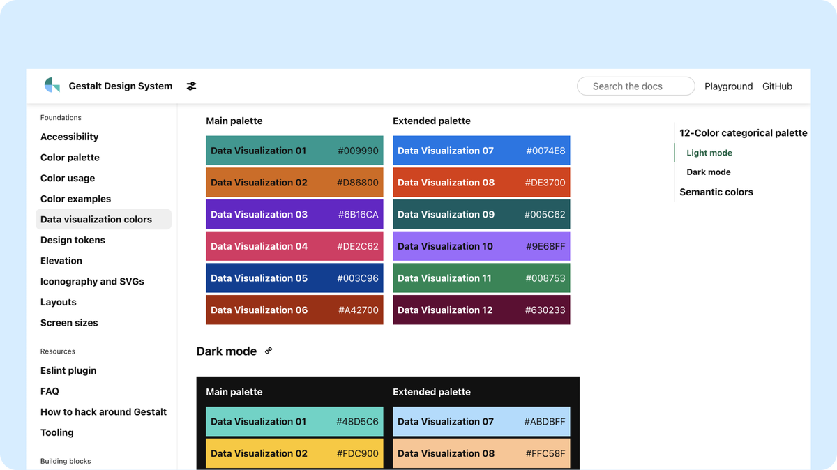
Data visualization guidelines

We recently shipped our data visualization color palette which was our building block to deliver data visualization guidelines. This is a major milestone for us and unlocks our ability to provide even more in this space later this year.
Design guidelines for Text and Heading components

We added typography guidelines a couple weeks ago and now we're coming in hot with design guidelines for Text and Heading. Our goal for these updates is to develop a strong foundation of typographic guidance that we can build upon in future releases.
Gestalt Learning released

We know that getting up to speed with Gestalt can take some work and we're constantly working to improve the onboarding process. That's why we released Gestalt Learning to offer a self-service learning path for important Gestalt topics. We have thoughts for additional content, but we'd love to hear your ideas! So, please reach out and give us your requests.
Note: This resource is available to Pinterest employees only.
Handoff kit screen/device templates added

We made nice update to our Figma Handoff kit with the addition of screen/device templates. This should give designers a faster starting point for designing their features. We have templates for web, mobile web, handset and tablet (for iOS and Android).
Week of June 10, 2022
No updates this week due to KnitCon

The Gestalt team is busy knitting, so there are no updates for this week. We hope you all enjoy KnitCon!
Week of June 3, 2022
New Typography guidelines

To keep the momentum going on our release of guidelines in 2022, we just published the first iteration of our Typography guidelines. This is intended to serve as the foundation for much more detail and updates in the future. We look forward to sharing many more typography-related updates in the near future.
Major updates to our Pin and Masonry Figma components

The Gestalt team has been busy iterating on a new revs of the Pin component and Masonry component in our Figma iOS library. Our focus for this iteration was to drastically simplify the experience of using it in designs. This new component leverages all the new fancy bells and whistles Figma recently released, which drastically reduced the number of variants for this component. We also added a built-in introduction to the component and guides on common use-cases. We think it's going to be big improvement.
However, big improvements sometimes lead to (dun dun dunnn) breaking changes. This Pin is so different that we needed to essentially build it from scratch as a new component. Don't fret though, we've kept our previous version of the Pin component in our library for backward compatibility. That component will be sunset on September 30, 2022.
An Updated What's New page

In an effort to make our Gestalt docs the single source of truth, it's now the home for our weekly updates. We know it's hard to keep track of everything we ship, so we want to provide an easily accessible and digestible synopsis of all the new goodies our team cooks up.
And for all you fans of our Changelog, never fear — it's not gone, it's just in a happier place now. You can view our full changelog on Gestalt Web Github repo.
Gestalt is on Pinterest!

Given Gestalt is built for Pinterest, it only seemed right to be on... Pinterest. So if you're feeling inspired to be inspired, check out our Gestalt Pinterest account. We pin all sorts of cool things (mostly about design systems, because well, duh). We have some cool stuff up our sleeve for this account, so stay tuned.
Week of May 26, 2022
Data visualization tokens added to Gestalt
The team is super excited to share that we shipped data visualization tokens to Gestalt this week! We’re hoping to build upon this work to develop dataviz components and guidelines in future sprints, so stay tuned!
New RadioButton Component
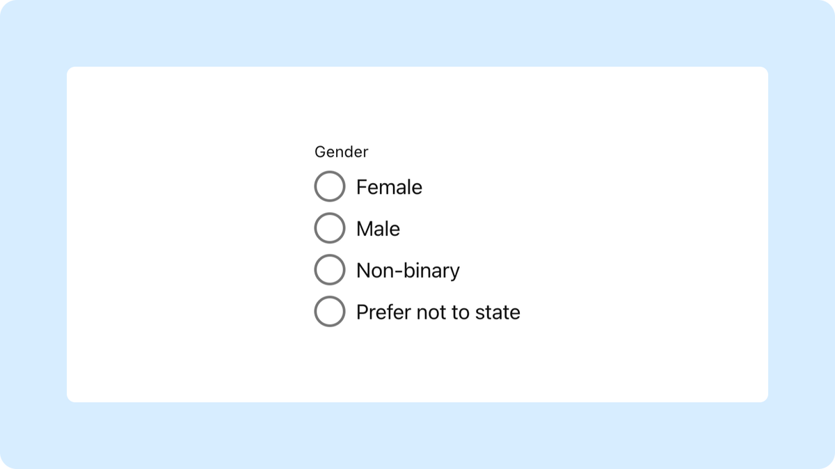
We recently shipped a new RadioGroup component which will make building forms easier and faster. The big change is that this component allows you to create a group of radio buttons as opposed to having to create each one independently. This may not have a ton of impact on your day-to-day, but we’re sharing it with you so that you remind your XFN buddies in case they aren’t aware. On that note, we’ve also deprecated our RadioButton component in favor of RadioGroup.
Gestalt Open Forum — Iconography workshop!
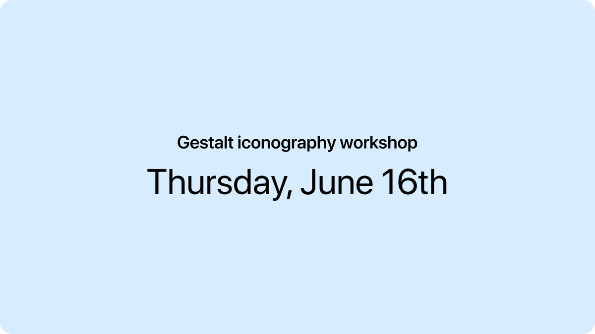
We know you care a lot about icons, and it’s a hot topic and priority for Gestalt! So we’re planning an icon “workshop” that will happen during our next Gestalt Open Forum meeting (June 16th). Please join us and help us evolve our iconography guidelines — we need your input!